


This blog post is intended for fellow webmasters of this site, and is also posted on my website.
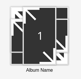
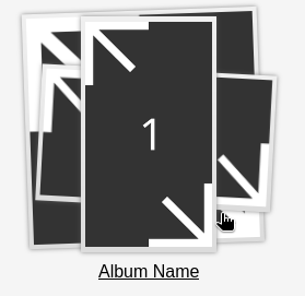
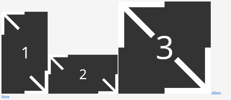
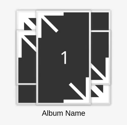
This tutorial will teach you how to make an HTML album component, as shown above, for the gallery or artwork pages for your websites. This component is inspired by early smartphone and skeuomorphic design, such as Samsung's Gallery app on their old phones. Much like the inspiration, this component will have images that are stylized to have photo borders, are visibly stacked on each other, and complete with animations. Ready to replace your boring square image* link?
*I actually do this tool in mobile mode. Still keep accessibility in mind!
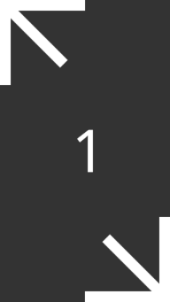
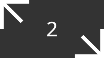
Before we begin, I'm going to assume that you know how to setup a new HTML file and that is what you will be working with in this tutorial. I'll also assume that you are using your own images for this tutorial. The ones I'll use are below:

HTML Breakdown
This component is intended to be a link. As such, all the elements that we create from now on will be a child of a single a element.
We'll then add a span element to the anchor, which will contain our images. We'll also give this span the class name imgs-holder. We then add three <img> tags as a child to this span. Of course, set the src attribute to the thumbnails you'd like to use. The alt attributes of the image elements can just be left empty.
The next child of the anchor will be another span element, which has the content of our name. As such, give this element the class name album-name.
<a href="#">
 <span class="imgs-holder">
   <img src="1.png" alt="" />
   <img src="2.png" alt="" />
   <img src="3.png" alt="" />
 </span>

 <span class="album-name">
   Album Name
 </span>
</a>
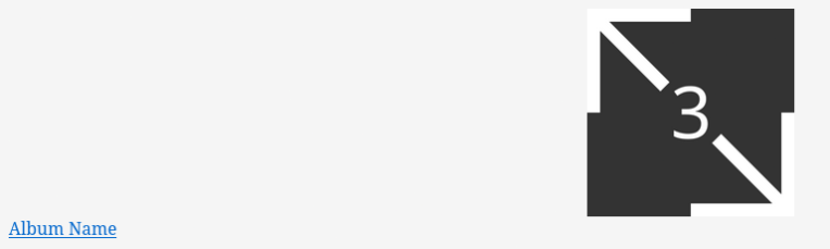
Without any styling, the page should look like the following below.
Clearly, styling is needed.
CSS Breakdown
Image Sizing & Stacking
Let's start killing the first bird by limiting the image sizes first.
img {
 max-height: 12rem;
 max-width: 12rem;
}
Moving on to the second bird, there's various ways to stack elements using CSS, but the method I'll use will be using CSS grid. Let's use a grid layout on imgs-holder. It should only have one column and row, and while we're at it, center the images too.
span.imgs-holder {
 display: grid;
 grid-template-columns: 1fr;
 grid-template-rows: 1fr;
 align-items: center;
 justify-items: center;
}
We also need to tell the images in which column and row they belong, otherwise they will be placed in newly created rows, which is what we don't want.
img {
  grid-column: 1;
  grid-row: 1;
  ...
}
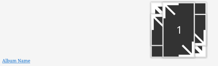
Now, the images should be stacked... But don't blame yourself if you can't tell.
Header Order & Frames
After setting up image stacking, you may have noticed that the images are stacked in the wrong order. As such, we'll have to tell each image what order they should be in.
img:first-child {
  order: 3;
}

img:nth-child(2) {
  order: 2;
}

img:last-child {
  order: 1;
}
In addition to making each image visible and differentiable from one another, let's also add some image borders. From my personal experience, I found that HTML elements that use the border property have weird effects when using transitions and transformations. Instead of using borders on the images, let's instead give the images some padding with a background. Let's also top it off with a light drop-shadow filter.
img {
  ...
  padding: 0.25rem;
  background: linear-gradient(rgb(240, 240, 240), rgb(220, 220, 220));
  filter: drop-shadow(0 0 2px rgba(96, 96, 96, 0.75));
}
Now, the images looks nice, but we still got to adjust the rest of the component.
Size, Alignment, & Text
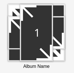
Currently, the component consumes the entire width of the page. Let's add a width and height for the component to use.
a {
  width: 16rem;
  height: 16rem;
}
Once the size has been set, let's then make the elements in the align to the component's center. We can do this with flexbox. We need to also specify that the direction the component is going in a column. Let's also add some spacing between the label and images.
a {
  display: flex;
  flex-direction: column;
  justify-content: center;
  align-items: center;
  gap: 0.5rem;
  ...
}
Finally, let's modify the text to be black, set the font, and remove the underline (at least when the component isn't focused or hovered).
a {
  ...
  color: black;
  font-family: Arial, sans-serif;
  text-decoration: none;
}
Now, it's time for the component to react to our hovers and focuses.
Transforms and Animation
The component will do four things when hovered/focused:
- Have all images grow in size.
- Have the two images behind the first slightly move outward.
- Have the label move slightly downward to get out of the images' way.
- Animate all the transformations above.
Each image will scale with the same factor. So let's create a scale variable so we don't have to type in the same value each time and in case we would like to easily adjust the scaling factor.
:root {
 --scale: scale(1.075);
}
We can easily animate the transformations of img and span.album-name with the transition property.
img,
span.album-name {
 transition: transform 0.1s;
}
Since this component is a link, we should probably indicate that by underlining the text on hover/focus.
a:focus,
a:hover {
 text-decoration: underline;
}
And now, time it's time to add all the transformations we would like to apply to our images and label.
a:focus img:first-child,
a:hover img:first-child {
  transform: var(--scale);
}

a:focus img:nth-child(2),
a:hover img:nth-child(2) {
  transform: var(--scale) translate(0.4rem, 0.25rem) rotate(3deg);
}

a:focus img:last-child,
a:hover img:last-child {
  transform: var(--scale) translate(-0.3rem, -0.345rem) rotate(-2deg);
}

a:focus span.album-name,
a:hover span.album-name {
  transform: translateY(0.5rem)
}
And... Voilà!
Full Code
The code below is also available on Codeberg.
<!DOCTYPE html>
<html lang=" en">

<head>
 <meta charset="UTF-8">
 <meta name="viewport" content="width=device-width, initial-scale=1">
 <title>Album Component</title>
</head>

<body>
 <a href="#">
   <span class="imgs-holder">
     <img src="1.png" alt="" />
     <img src="2.png" alt="" />
     <img src="3.png" alt="" />
   </span>

   <span class="album-name">
     Album Name
   </span>
 </a>
</body>

<style>
 /* This was for screenshots. */
 body {
   background: #f5f5f5;
 }

 :root {
   --scale: scale(1.075);
 }

 a {
   display: flex;
   flex-direction: column;
   justify-content: center;
   align-items: center;
   gap: 0.5rem;

   width: 16rem;
   height: 16rem;

   color: black;
   font-family: Arial, sans-serif;
   text-decoration: none;
 }

 span.imgs-holder {
   display: grid;
   grid-template-columns: 1fr;
   grid-template-rows: 1fr;
   align-items: center;
   justify-items: center;
 }

 img {
   grid-column: 1;
   grid-row: 1;

   max-height: 12rem;
   max-width: 12rem;
   padding: 0.25rem;
   background: linear-gradient(rgb(240, 240, 240), rgb(220, 220, 220));
   filter: drop-shadow(0 0 2px rgba(96, 96, 96, 0.75));
 }

 img:first-child {
   order: 3;
 }

 img:nth-child(2) {
   order: 2;
 }

 img:last-child {
   order: 1;
 }

 img,
 span.album-name {
   transition: transform 0.1s;
 }

 a:focus,
 a:hover {
   text-decoration: underline;
 }

 a:focus img:first-child,
 a:hover img:first-child {
   transform: var(--scale);
 }

 a:focus img:nth-child(2),
 a:hover img:nth-child(2) {
   transform: var(--scale) translate(0.4rem, 0.25rem) rotate(3deg);
 }

 a:focus img:last-child,
 a:hover img:last-child {
   transform: var(--scale) translate(-0.3rem, -0.345rem) rotate(-2deg);
 }

 a:focus span.album-name,
 a:hover span.album-name {
   transform: translateY(0.5rem)
 }
</style>

</html>


 cheshyre
 VyletPony
 Lothyde


